Treasure Island
X marks the mispricings. But they don't always lead to gold.
Part 5 of 6: Statistical Arbitrage for Independent Traders
Previously:
A Tale of Two Prices (the core idea of stat arb)
Moneyball (finding good pairs using metrics that matter)
The Winter of our Pairs Trading Discontent (problems, limitations, frustrations)
The Metamorphosis (from pairs to portfolio)
Last time, I showed you a pattern in energy spreads and asked what it meant.
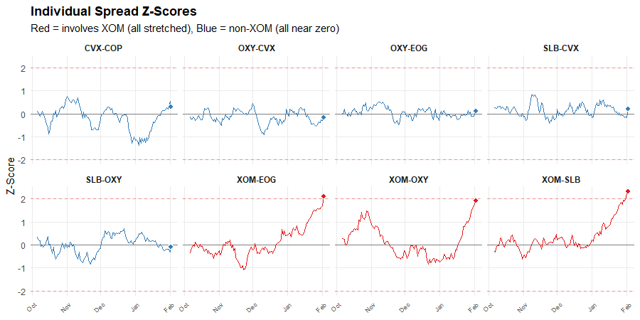
The answer seemed obvious: XOM is the outlier. Every spread involving XOM is stretched. The spreads not involving XOM are near zero.
But on this seemingly obvious map of mispricings, XOM may not mark the spot…
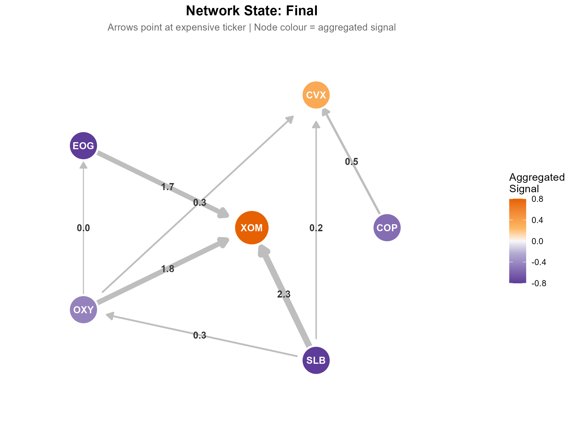
The name Triangulated Stat Arb comes from triangulation, the navigation technique. One bearing on a landmark gives you a line. Two bearings give you a point. Three or more, all meeting at the same spot, give you a fix.
Each spread is a bearing. It’s casting a vote: “ticker A looks rich relative to ticker B.”
One spread voting that XOM is expensive is useful but limited information. Maybe SLB got cheaper, not XOM got richer. If three spreads all vote that XOM is expensive, then things are clearer. But do we actually have a “fix?”
In navigation, a fix is definitive. In trading, it’s not that clean. It tells you where the network of overlapping spreads is pointing, but it doesn’t tell you what you’ll find when you get there.
But this is still very useful information. It narrows the question from “something in this pair is mispriced” to “this specific thing looks mispriced relative to its peers.” That’s a big step.
Of course, stocks don’t only move on mean-reverting noise trading. Sometimes the network points at a ticker that moved on real news. A fix tells you what looks mispriced. But it doesn’t tell you why it moved.
We’ll come back to that. First, the bigger picture.
The XOM example is obvious because all the spreads point the same way. But XOM is just one ticker in a small network.
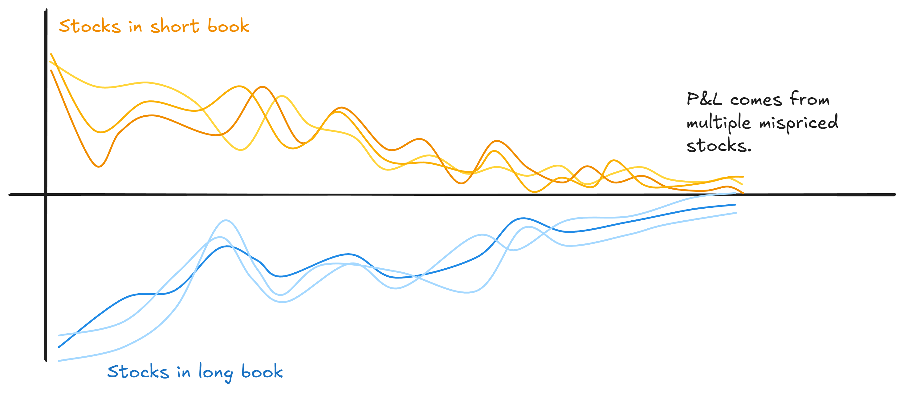
Scale this up. A real universe might have 40 or 60 or 100 stocks connected by heaps of overlapping spreads. Apply triangulation across that whole network and you get something more powerful than identifying a single outlier: you get a portfolio of (potentially) mispriced legs.
Your long book is full of stuff the network says is cheap relative to its peers. Your short book is full of stuff that it says is rich. Every position is targeting an apparent mispricing.
Compare that to traditional pairs, where half your positions are fair-value hedges just along for the ride. (We covered this problem in Part 3.)
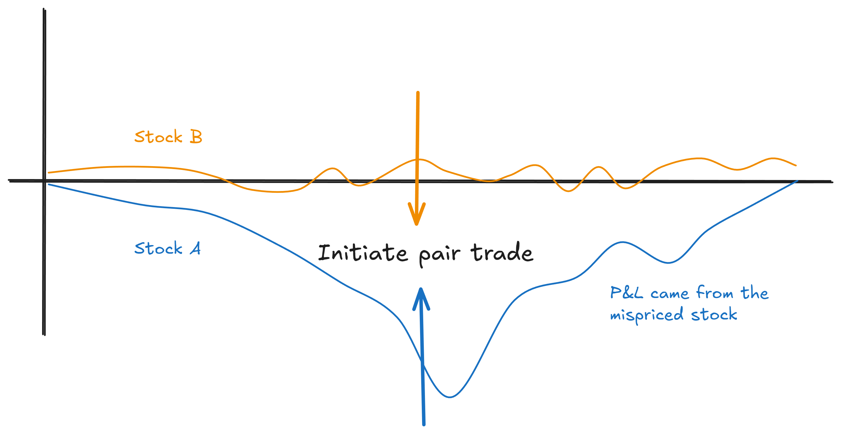
Instead of finding one mispriced stock, we build a long/short book where every position has a reason to be there.
This next insight surprised me when I first started researching this. You get a lot of the benefit just from the flattening step we covered last time.
The simple act of aggregating votes from multiple spreads naturally tends to build this kind of portfolio of mispriced stocks.
Stuff that’s genuinely mispriced shows up as mispriced against multiple partners. Noise tends to wash out. You end up long the things that are cheap across multiple relationships and short the things that are rich.
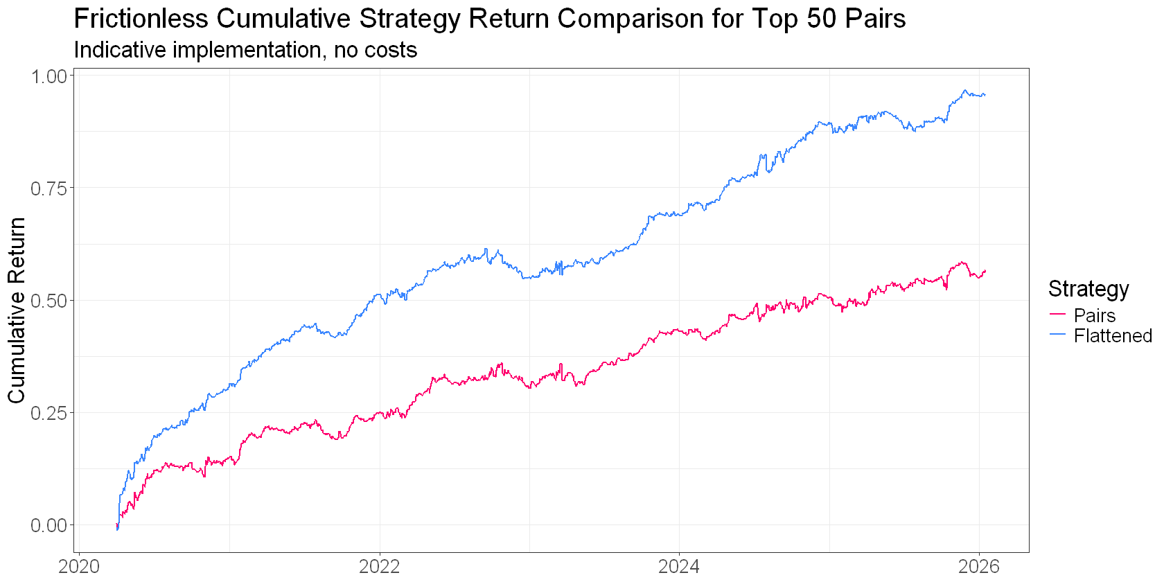
That simple reframe does a lot of heavy lifting. Spreads as evidence, not trades.
Remember the caveat from earlier: not every dislocation is a genuine mispricing.
Some of those tickers moved on real news, not noise.
But if you’ve done a good job of picking pairs, you’ll find that price-insensitive flows drive divergences a lot more often than genuine repricings do. That’s the base rate, and it’s working in your favour. Flattening just scales it up and gets the law of large numbers on your side faster.
But you can do better than the base rate alone. You can sharpen which tickers the network is most confident about.
When you flatten, each ticker accumulates votes from multiple spreads. Some votes say “rich,” others say “cheap.” How much the votes agree is useful information.
Consistency measures this directly: it’s just the absolute value of the mean of the signs. Convert each signal to +1 or -1, average them, take the absolute value. Nothing fancy.
This approach will penalise disagreements quite harshly:
If all votes agree, the consistency metric comes out at one.
Five out of six: 0.67
Four out of six: 0.33.
A 50-50 split results in zero.
It’s not a perfect metric. For example, a ticker that only appears in two spreads will always get either zero or one. So you need to think about how you handle that.
But on the whole, it’s a nice, simple way to weight the flattened signals to take advantage of more information.
High consistency means the network is pointing clearly at this ticker. Low consistency means conflicting information. More likely noise. Discount it.
This matters because a ticker with a strong average signal but low consistency is probably just the partner of something that actually moved. The spreads disagree about this ticker, which means it’s likely not the mispriced one. A ticker with a moderate signal but high consistency implies that every spread agrees. That’s a cleaner signal.
When I tested this across different universe sizes and time periods, consistency-weighted signals outperformed simple averages.
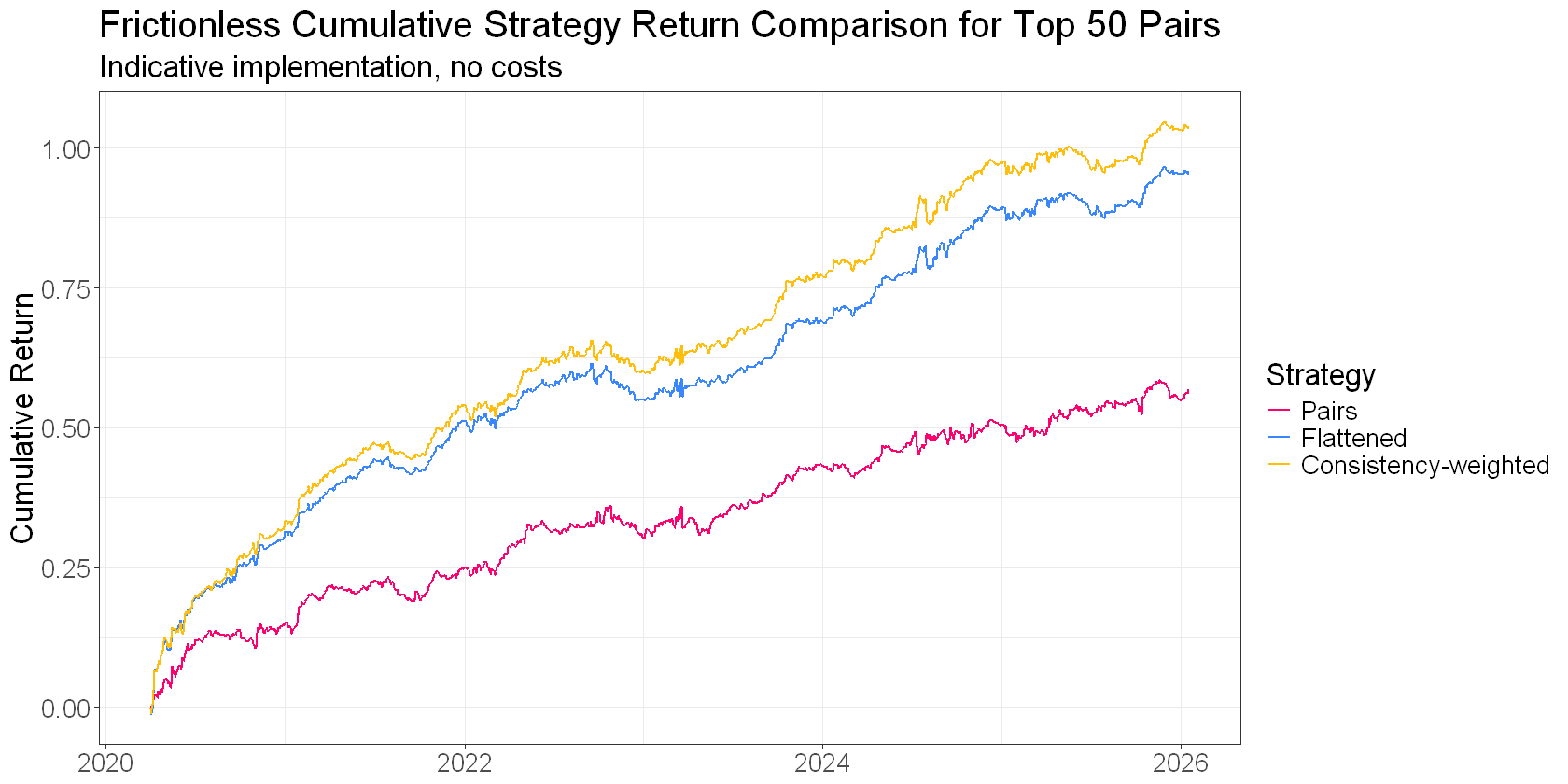
I reckon this is one of those cases where the obvious thing to try actually works.
So the network agrees: XOM is the outlier. Three spreads, same conclusion.
But there’s a question we haven’t answered…
Why is XOM the outlier?
Maybe XOM got dislocated by some temporary flow. A big fund rebalancing its energy exposure, or a hedging flow working through the book. Price-insensitive activity that pushed the price without any change in fundamentals. That dislocation should wash out. That’s our opportunity.
Or maybe XOM just repriced on real news. An earnings surprise, a production update, a regulatory shift specifically impacting XOM.
In that case, XOM isn’t mispriced at all. The fix is pointing you at a stock that moved for a good reason.
Both scenarios look identical in terms of z-scores. Triangulation tells you what the network thinks is mispriced. But it can’t tell you whether the network is right.
If you pick good pairs, pairs that tend to diverge and converge in tradeable ways, you’ll be right more often than you’re wrong. Price-insensitive flows happen more frequently than genuine repricings.
In that case, the base rate works in your favour (but you really do need to pick good pairs!!). You could accept that you’ll be wrong sometimes, and that’s just a cost of doing business.
Or you could try to do better…
It turns out that there are things outside spread relationships that indicate informed buying or selling.
The usual suspects: earnings surprises, idiosyncratic news.
Volume data around a dislocation is also telling.
The pattern of trading activity often looks different when a stock is getting pushed around by price-insensitive flows versus when it’s repricing on information. And when you go digging into the effects, you find they work differently on the long side than the short side. Which, when you stop and think about it, makes a lot of sense.
This sort of information can help you side-step those annoying occasions when your spread diverges, but fails to come back together again. It’s not fool-proof of course, but a good implementation can really improve things.
I explore this in detail with my RW Pro group, where we’ve built these features into our live stat arb implementation.
One more cool thing I want to show you.
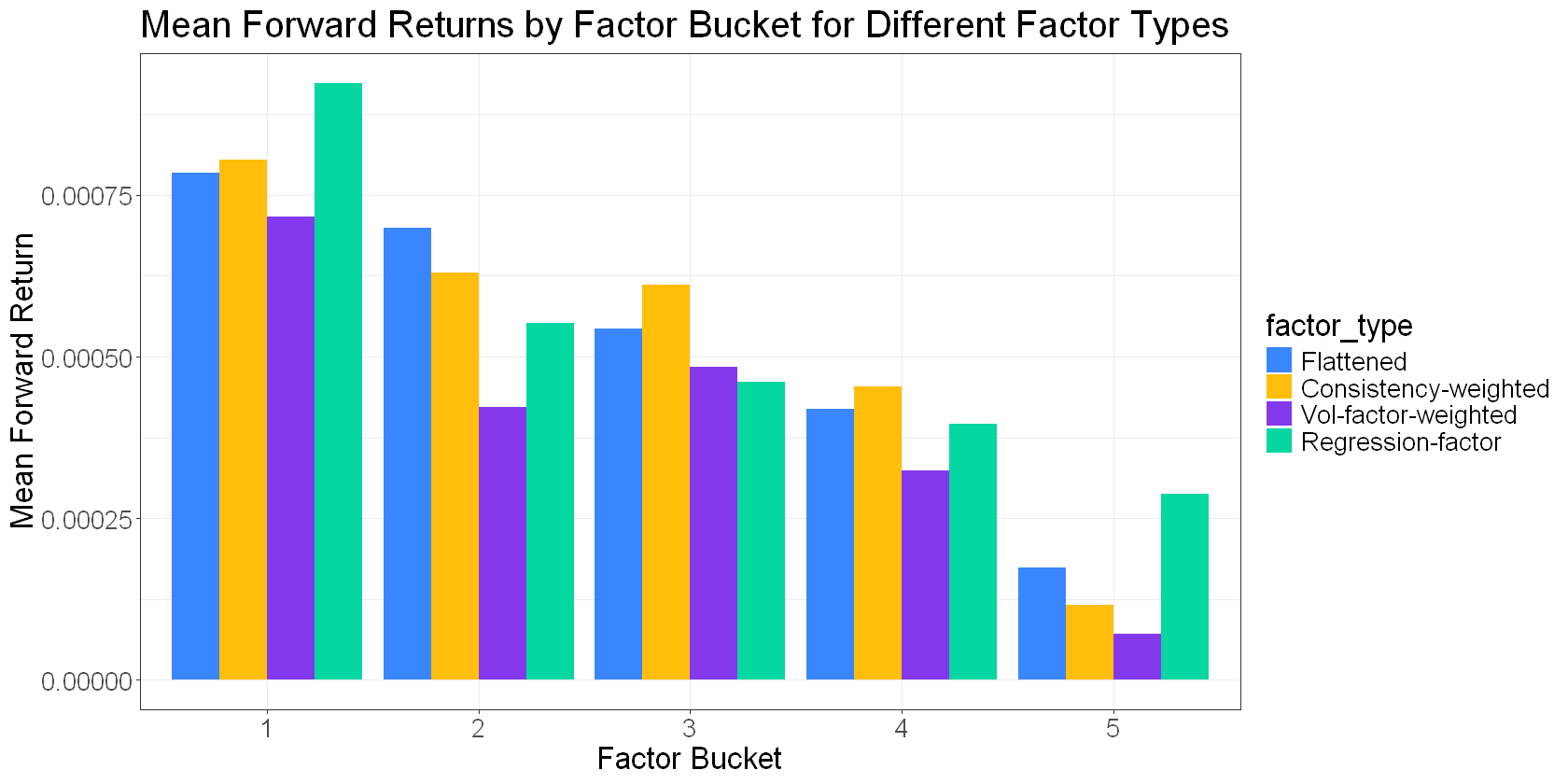
Consider that in the triangulated stat arb framing, we can treat each spread’s z-score as the difference in ticker mispricings, or “alpha:”
We observe the left-hand side (our spread z-scores), and we want to infer the right-hand side (ticker alphas).
We can run a regression to find the ticker alphas that best explain the spread z-scores simultaneously.
This gives us a “regression factor” that I can add to our growing collection:
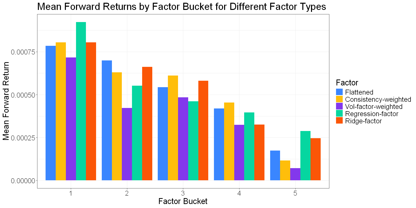
A standard regression minimises the sum of squared alphas, which will tend to spread the signal across all the tickers. But perhaps a better solution would be one that concentrates the signal in as few tickers as necessary.
This implies that lasso regression (which forces coefficients to zero) or ridge (which shrinks them towards zero) might be decent approaches.
Adding a “ridge regression factor” to the list:
Here’s a plot of cumulative returns to each of these network-derived factors for a rolling universe of our top 50 pairs. This isn’t a backtest… There are no costs or frictions. The intent is to get a high-level comparison of the different approaches:
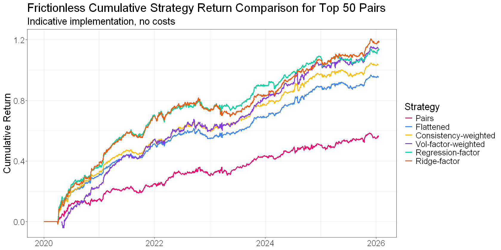
None of these factors is necessarily “better” (at least, we can’t really tell from what I’ve shown you here). But they do come with different trade-offs. Some tend to have higher turnover. Others tend to decay faster. Some will push you into more concentrated positions if you’re not careful.
There are also interesting dynamics when you sort your tickers by the “quality” of the spreads they came from. I haven’t really explored that with you, but it’s yet another dimension.
Anyway, what I’ve presented here isn’t an exhaustive examination. My objective was to demonstrate the step changes from traditional pairs trading to a triangulated stat arb approach, both in performance and complexity.
That’s the real takeaway. You get a significant boost in risk-adjusted returns over traditional pairs trading with the triangulated stat arb approach, but you pay a cost in complexity.
The other factors and modifications are great, but you get the bulk of the benefit just from reframing the problem from pairs to portfolio (in the plot above, the jump from pairs to flattening is greater than the jump to any of the “better” flattened signals).
Let’s step back and look at what we’ve covered across this series. The problem breaks down into three pieces.
Find good pairs. Pick spreads that are likely to diverge and converge in tradeable ways. That’s the selection pipeline we looked at in Parts 2 and 3. Measuring what you actually care about, directly.
This is the most important part. Without this, the rest is irrelevant.
Identify the mispriced legs. Figure out what’s actually mispriced relative to its peers. That’s the triangulated stat arb part: flatten spread signals to ticker-level signals, use consistency to measure the network’s agreement, build a portfolio where every position is targeting a mispricing.
This does a lot of heavy lifting. The pairs to portfolio change offers a step change in performance and capital efficiency, but also complexity.
Separate mispricing from repricing. Try to predict when an apparent mispricing is actually a genuine repricing. That’s where volume and news features come in. It’s a bit harder than it sounds and to be frank, the juice may not be worth the squeeze. Your mileage may vary.
This is the icing on the cake. Trading a portfolio of apparent mispricings is a fine approach, so long as your pair selection approach is in order. You’ll be wrong plenty, but you should be right more than you’re wrong. But if you can avoid some of those repricings, you’ll see another step change in performance.
Each piece matters, but to a different extent.
Good pairs are the foundation; you’re sunk without them. Triangulation and consistency squeeze more out of those pairs than traditional approaches can. Volume and news features help you avoid the traps.
Getting all three right is what makes this approach really sing. It’s also what makes it hard. There are a lot of moving parts, and each one has subtleties that aren’t obvious until you start trading it.
Next time, I’ll show you what it looks like when you resource all three pieces properly.
If you’re finding this useful, check out my case study on how I went from corporate quant to independent trader. Click here to grab a copy.
Great series ! I’m really looking forward to part 6!
I was wondering, did you use real data from the energy tickers (EOG, OXY, SLB, XOM…) to calculate their spread? I checked my pair trading implementation and had no signal for them from Oct to Feb 2026, maybe it’s a different year? If it’s not to much to ask, what lookback period do you usually use to normalize the spread (mean and std)?
Thanks a lot and keep posting! 😀